

# Why Every Business Needs a Fast, Mobile-Responsive Website in 2026
More than half of all web traffic today comes from mobile devices. If your website isn’t fast and fully responsive, you’re not just providing a poor experience — you’re actively losing customers before they even see what you offer.
## What “Responsive” Actually Means
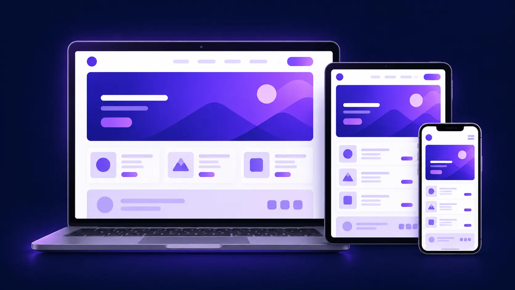
A responsive website automatically adjusts its layout, images, and text based on the screen size it’s being viewed on — whether that’s a phone, tablet, laptop, or large desktop monitor. It’s not just about “shrinking” content to fit a smaller screen; it’s about rethinking navigation, button sizes, and content priority so the experience feels natural on every device.
## Why Speed and Responsiveness Go Hand in Hand
A responsive design means nothing if the site takes five seconds to load on mobile data. Studies consistently show that most visitors abandon a page if it takes longer than three seconds to load. That’s why responsiveness and speed have to be treated as one problem, not two separate ones.
At WebTechKey, every site we build is optimized for Core Web Vitals — the performance metrics Google uses to judge user experience — so your site loads quickly regardless of the device or connection speed.
## The Business Impact
1. **Higher conversions** — visitors are far more likely to fill out a form, make a purchase, or call your business when the experience is smooth on their device.
2. **Better SEO rankings** — Google uses mobile-first indexing, meaning it primarily looks at your site’s mobile version to determine search rankings.
3. **Lower bounce rates** — a frustrating mobile experience sends visitors straight back to the search results, often to a competitor’s site.
4. **Stronger brand trust** — a polished, functional site signals professionalism before a visitor even reads a word of your content.
## Common Mistakes We See
– Text or buttons too small to tap comfortably on mobile
– Images that aren’t optimized, causing slow load times
– Pop-ups that cover the entire mobile screen with no easy way to close them
– Desktop-first designs that were never truly rebuilt for mobile, just scaled down
## How We Approach It
Every project starts with a mobile-first mindset. We design for the smallest screen first, then scale up — ensuring nothing important gets lost or crammed in as an afterthought. Combined with performance optimization (compressed images, clean code, fast hosting), this gives you a site that performs well no matter how someone finds you.
## Ready for a Website That Works on Every Screen?
If your current site feels clunky on mobile or loads slowly, it might be costing you more customers than you realize. Get in touch with our team for a free assessment of your site’s mobile performance.